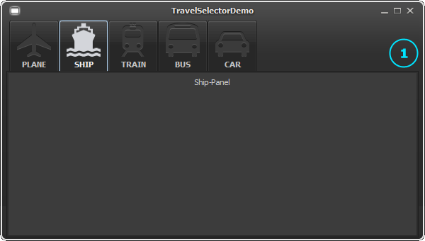
In this article we describe how to create a custom JYTabbedPane style which will be used as main selector component - similar to page navigation from some popular websites. The result of the customization work is shown below.

Let's start with the Swing code used in the demo to create the tabbed panel.
JYTabbedPane tabbedPane = new JYTabbedPane();
tabbedPane.addTab("<html><b>PLANE</b></html>", createPanel("Plane-Panel"));
tabbedPane.addTab("<html><b>SHIP</b></html>", createPanel("Ship-Panel"));
tabbedPane.addTab("<html><b>TRAIN</b></html>", createPanel("Train-Panel"));
tabbedPane.addTab("<html><b>BUS</b></html>", createPanel("Bus-Panel"));
tabbedPane.addTab("<html><b>CAR</b></html>", createPanel("Car-Panel"));

//set tab icons
String[] icons = new String[]{"/demo/travelselector/plane.png", "/demo/travelselector/plane_selected.png",
        "/demo/travelselector/ship.png", "/demo/travelselector/ship_selected.png",
        "/demo/travelselector/train.png", "/demo/travelselector/train_selected.png",
        "/demo/travelselector/bus.png", "/demo/travelselector/bus_selected.png",
        "/demo/travelselector/car.png", "/demo/travelselector/car_selected.png"};
for (int i=0; i<tabbedPane.getTabCount(); i++)
{
  JLabel l = tabbedPane.getTabLabelAt(i);
  l.setIcon(new TabIcon(tabbedPane, i, icons[i*2], icons[i*2+1]));
  l.setHorizontalTextPosition(SwingConstants.CENTER);
  l.setVerticalTextPosition(SwingConstants.BOTTOM);
}
The TabIcon makes use of two icon delegates to support unselected and selected tabs.
private static class TabIcon implements Icon
{
  private JTabbedPane tabPane;
  private int index;
  private Icon regularIcon;
  private Icon selectedIcon;

  public TabIcon(JTabbedPane tabPane, int index, String regularIconPath, String selectedIconPath)
  {
    this.tabPane = tabPane;
    this.index = index;
    this.regularIcon = new ImageIcon(getClass().getResource(regularIconPath));
    this.selectedIcon = new ImageIcon(getClass().getResource(selectedIconPath));
  }

  public void paintIcon(Component c, Graphics g, int x, int y)
  {
    if (index == tabPane.getSelectedIndex())
      selectedIcon.paintIcon(c, g, x, y);
    else
      regularIcon.paintIcon(c, g, x, y);
  }

  public int getIconWidth()
  {
    return (index == tabPane.getSelectedIndex()) ? selectedIcon.getIconWidth() : regularIcon.getIconWidth();
  }

  public int getIconHeight()
  {
    return (index == tabPane.getSelectedIndex()) ? selectedIcon.getIconHeight() : regularIcon.getIconHeight();
  }
}
Because we use HTML-based labels for all tabs and also want to respect the default foreground colors, we have to add some code to update the label foreground. Update: Since SyntheticaAddons V1.6 this is no longer needed.
//update foreground for HTML labels
tabbedPane.addChangeListener(new ChangeListener()
{
  public void stateChanged(ChangeEvent evt)
  {
    JYTabbedPane tabPane = (JYTabbedPane)evt.getSource();
    for (int i = 0; i < tabPane.getTabCount(); i++)
      tabPane.getTabLabelAt(i).setForeground(null);
  }
});
Here's the resulting screenshot:
In the next step we create a custom style and apply the style to the component. For this we create a XML file called "selectorTabbedPane.xml" and add some base declarations to remove/reduce all predefined insets.
<synth>

<!--
*******************************************************************************
SelectorTabbedPane
*******************************************************************************
-->
  <style id="selectorTabbedPane">
    <insets top="0" left="0" bottom="0" right="0"/>
  </style>
  <bind style="selectorTabbedPane" type="name" key="TabbedPane.SelectorTabbedPane"/>

  <style id="selectorTabbedPaneContent">
    <insets top="0" left="0" bottom="0" right="0"/>
  </style>
  <bind style="selectorTabbedPaneContent" type="name" key="TabbedPaneContent.SelectorTabbedPane"/>

  <style id="selectorTabbedPaneTabArea">
    <insets top="0" left="0" bottom="0" right="0"/>
  </style>
  <bind style="selectorTabbedPaneTabArea" type="name" key="TabbedPaneTabArea.SelectorTabbedPane"/>

  <style id="selectorTabbedPaneTab">
    <insets top="0" left="0" bottom="0" right="0"/>
  </style>
  <bind style="selectorTabbedPaneTab" type="name" key="TabbedPaneTab.SelectorTabbedPane"/>

</synth>
Now we load and apply the style to the tabbed panel.
//load custom style
UIManager.setLookAndFeel(new SyntheticaBlackEyeLookAndFeel(){
  @Override
  protected void loadCustomXML() throws ParseException
  {
    loadXMLConfig("/demo/travelselector/selectorTabbedPane.xml");
  }
});
...
JYTabbedPane tabbedPane = new JYTabbedPane();
//apply style
tabbedPane.setName("SelectorTabbedPane")
In the screenshot below you can see that all the space around the sub-elements doesn't appear any longer.

Because we need some space for the selector, we modify tab insets. Additionally we add text related color settings.
  <style id="selectorTabbedPaneTab">
    <insets top="8" left="2" bottom="22" right="2"/>
    <defaultsProperty key="JYTabbedPane.tab.selectedBold.SelectorTabbedPane" type="boolean" value="false"/>
    <state>
      <color type="TEXT_FOREGROUND" value="#8B8D92"/>
    </state>
    <state value="SELECTED">
      <color type="TEXT_FOREGROUND" value="#D6D7DC"/>
    </state>
  </style>
  <bind style="selectorTabbedPaneTab" type="name" key="TabbedPaneTab.SelectorTabbedPane"/>

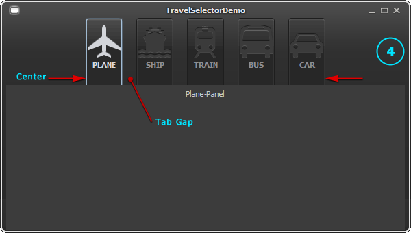
By specifying some JYTabbedPane properties, tabs will be centered and some additional space between the tabs appears.
  <style id="selectorTabbedPane">
    <insets top="0" left="0" bottom="0" right="0"/>
    <!-- 0 is Swing constant for CENTER -->
    <defaultsProperty key="JYTabbedPane.horizontalTabAlignment.SelectorTabbedPane" type="integer" value="0"/>
    <defaultsProperty key="JYTabbedPane.tabGap.SelectorTabbedPane" type="integer" value="20"/>
    <defaultsProperty key="JYTabbedPane.tabReorderByDraggingEnabled.SelectorTabbedPane" type="boolean" value="false"/>
    <defaultsProperty key="JYTabbedPane.tabControlsShowStrategy.SelectorTabbedPane" type="string" value="NEVER"/>
  </style>
  <bind style="selectorTabbedPane" type="name" key="TabbedPane.SelectorTabbedPane"/>
In the next step we specify a background image for the tab area.
<style id="selectorTabbedPaneTabArea">
  <insets top="0" left="0" bottom="0" right="0"/>
  <state>
    <string id="tabbedPaneTabAreaBackground">/demo/travelselector/tabAreaBackground.png</string>
    <defaultsProperty key="Synthetica.tabbedPane.tabArea.background.image.top.SelectorTabbedPane" type="idref" value="tabbedPaneTabAreaBackground"/>
    <defaultsProperty key="Synthetica.tabbedPane.tabArea.background.image.top.insets.SelectorTabbedPane" type="insets" value="2 0 10 0"/>
  </state>
</style>
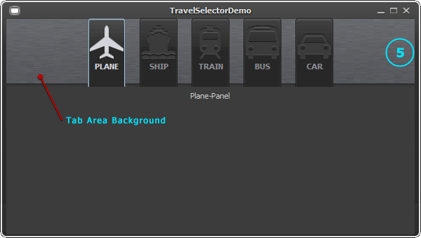
As you can see, the tab area background is streched by default. Because the background also contains a "noise-texture", the scale policy has to be set to TILED. For this and for painting the selector icon we specify our own painter class which implements some simple paint operations.
  <style id="selectorTabbedPane">
    <insets top="0" left="0" bottom="0" right="0"/>
    <object class="demo.travelselector.SelectorTabbedPanePainter" id="painter"/>
    <defaultsProperty key="Synthetica.JYTabbedPanePainter.SelectorTabbedPane" type="idref" value="painter"/>
...
public class SelectorTabbedPanePainter extends JYTabbedPanePainter
{
  private static Icon selectorIcon;

  @Override
  public void paintTabbedPaneTab(JComponent c, SyntheticaState state, int tabIndex, int placement, int position, int angle, Graphics g, int x, int y, int w, int h)
  {
    if (!state.isSet(State.SELECTED))
      return;

    if (selectorIcon == null)
      selectorIcon = new ImageIcon(getClass().getResource("/demo/travelselector/tabbedPaneSelector.png"));

    x += (w-selectorIcon.getIconWidth())/2;
    y += h-selectorIcon.getIconHeight();
    selectorIcon.paintIcon(c, g, x, y);
  }

  @Override
  public void paintTabbedPaneTabAreaBackground(JComponent c, SyntheticaState state, int placement, int angle, Graphics g, int x, int y, int w, int h)
  {
    String imagePath = SyntheticaLookAndFeel.getString("Synthetica.tabbedPane.tabArea.background.image.top", c);
    Insets insets = SyntheticaLookAndFeel.getInsets("Synthetica.tabbedPane.tabArea.background.image.top.insets", c);
    ImagePainter imagePainter = new ImagePainter(g, x, y, w, h, imagePath, insets, insets, ImagePainter.TILED, ImagePainter.STRETCHED);
    imagePainter.draw();
  }
}
That's it - the result looks much more appealing.


Download Demo Sourcecode
Note: Of course it's possible to do similar customization for left/right/bottom placed tabs. All UI-property keys are listed in the API-Doc - see related UI-delegate and painter classes.
Related Posts